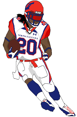
So all-in-all, in turned out to be a mix between Utah and Virgina Tech, and I was able to make it exactly the same on Madden (except the Under Armour horns). I think it looks pretty good on the field.
Enough talking here is my presentation.
First off the logos and Helmet (Thanks to Firefly from the CCSLC forum)

Jerseys:
Home

Away

Alternate

Pants (All Sets are Monochrome)

And here are the sets in Action!!!


So tell me what you guys think!

6 comments:
These are pretty cool. The action shots look much better than the plain jerseys, so I'm glad you added those.
I dont like the helmes that much, but the rest is great!
i love them (all but the helmets) and can you send me the templates for the still (all skin colors) and action shots, if its not too much trouble. tb_hockeycrazy93@yahoo.com
okay I will
i would change the # font to better match the wordmark and just prolly make the helmet white, and it would look better IMO
no i like the red helmets but i dont like the idea of not having the primary on it. Also I understand what sizemorematters is saying about the numbers
Post a Comment