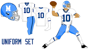
For this set, I tried to keep the modern style in it, kind of like the Jets old look with Namath and now, I included the Retro template in this because I don't think you capture the overall retro style unless you see it on there. The thing most different about this one is the blue stripe is more like USC's, and then the sleeves are white, but it doesn't make a side panel on there. For the logo, I just made the silhouette of a Hawk Clip art logo and that's how I got that.

and here is the Memphis retro set, I think this was preety much your idea Mykl.


10 comments:
I like it.
I say take out the blue and make the stripes white and the sleeves red, b/c that would make it look more retro IMO.
Random, but Mike have you heard of Orange Beach or Gulf Shores Alabama?
Yep I go there every summer on vacation, and I think it looks better like this sizemore so unless Chuck want's it different it is staying the same, also that would take too much blue away from the jersey.
Oh sweet. I'm going there for Spring Break this year. ^_^
I think you should tone down the colours a tad.
Ah man, I was going too but I think we are waiting till the summer, we went last year at spring break and the water was preety chili some of the days, but it wasnt that bad, because it wasnt really hot outside, what condo/hotel are you staying in? If you dont know yet, the Phoenix condo is awesome!
Yep, that's what I was thinking.
I cant remember of the top of my head, but I'll ask my dad.
And, frankly, it has to be better than Wisconsin water. :-/
Post a Comment